
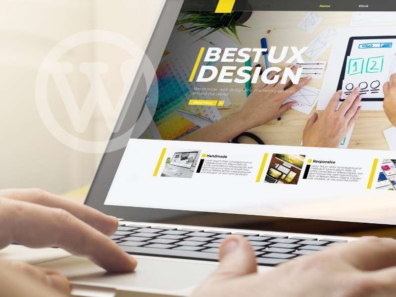
Embarking on the journey of customizing your WordPress theme opens up a realm of possibilities, allowing you to tailor the visual identity and functionality of your website to suit your unique style and goals. In this beginner’s guide, we’ll navigate the landscape of theme customization, offering insights and step-by-step instructions to empower you in crafting a website that stands out.
Understanding the Basics: Your Theme’s Foundation
Embarking on the journey of customizing your WordPress theme begins with a solid grasp of the fundamental elements that shape your website’s visual identity and functionality. In this exploration of the theme’s foundation, we delve into key considerations and actions that lay the groundwork for your customization endeavours.
- Theme Selection: Navigating the Digital Aesthetic Landscape
- Explore the Theme Library:
- WordPress offers a diverse array of themes, ranging from sleek and modern to classic and timeless. Navigate to the “Themes” section in the WordPress dashboard to browse and select a theme that aligns with your website’s purpose, content, and overall aesthetics.
- Free vs. Premium Themes:
- Choose between free and premium themes based on your budget and specific requirements. While free themes offer a good starting point, premium themes often provide additional features, customization options, and dedicated support.
- Accessing the Customizer: Your Real-Time Workshop
- Navigate to “Customize”:
- Once you’ve selected your theme, initiate the customization process by navigating to “Appearance” in the WordPress dashboard and selecting “Customize.” This opens the Customizer, offering a live preview of your website alongside customization options.
- Real-Time Adjustments:
- The Customizer allows you to make real-time adjustments to various aspects of your website, providing an immediate visual representation of changes. This dynamic environment enables you to experiment and fine-tune your theme with ease.
- Customization Sections:
- The Customizer is organized into sections, each focusing on specific elements of your theme. These sections may include Site Identity, Colors, Typography, Header and Footer settings, and more. Explore each section to tailor your website to your preferences.
- Mastering Visual Customization: Shaping the Look and Feel
- Site Identity: Personalizing Your Brand Presence
- Start by establishing your site identity. Upload a logo that represents your brand, set a site title that reflects your website’s essence, and craft a tagline if applicable. These elements appear prominently in your site’s header, creating a visual foundation.
- Colors and Typography: Crafting Aesthetic Harmony
- Dive into colour and typography settings to define the overall look and feel of your website. Choose a colour scheme that aligns with your brand or personal taste. Experiment with font styles and sizes to enhance readability and visual appeal.
- Header and Footer Customization: Framing Your Content
- Tailor the header and footer of your website to create a cohesive visual experience. Adjust header layouts, background images, and navigation menus. Customize the footer by adding widgets, and providing additional information or links.
These initial steps set the stage for your customization journey, allowing you to establish the aesthetic foundation of your WordPress theme. As you navigate the theme selection process and immerse yourself in the Customizer, envision the unique identity you want your website to convey. Your theme’s foundation serves as the canvas upon which you’ll paint a digital masterpiece that resonates with your audience.
Mastering Visual Customization: Shaping the Look and Feel
In the realm of WordPress customization, mastering the visual elements is akin to becoming the architect of your website’s aesthetic identity. This phase of customization involves a nuanced exploration of design elements, ensuring that your website not only looks appealing but also resonates with your brand or personal style. Let’s delve into the intricacies of mastering visual customization and how to shape the overall look and feel of your WordPress theme.
- Site Identity: Personalizing Your Brand Presence
- Logo and Favicon:
- Start by uploading a logo that encapsulates your brand. The logo is a visual anchor that communicates the essence of your website. Additionally, consider adding a favicon, a small icon that appears in the browser tab, further reinforcing your brand identity.
- Site Title and Tagline:
- Craft a compelling site title that succinctly represents your website. If applicable, add a tagline to provide a brief description or mission statement. These elements contribute to the overall identity displayed in your site’s header.
- Colors and Typography: Crafting Aesthetic Harmony
- Color Scheme:
- Dive into the colour settings to define a cohesive colour scheme. Choose colours that align with your brand or convey the desired mood for your website. Consistent colour usage enhances visual appeal and creates a unified browsing experience.
- Font Styles and Sizes:
- Experiment with font styles and sizes to find a combination that complements your content and enhances readability. Consistency in font choices across your website contributes to a professional and polished appearance.
- Header and Footer Customization: Framing Your Content
- Header Layout and Background:
- Tailor the header to match your vision. Adjust the layout, header image, or background colour to create a visually striking and harmonious top section of your website. The header is often the first impression visitors have, so make it impactful.
- Navigation Menus:
- Customize navigation menus to streamline the user experience. Arrange menu items, create dropdowns for sub-pages, and ensure that your navigation structure is intuitive. A well-organized menu contributes to seamless navigation.
- Footer Widgets:
- Leverage footer widgets to add additional information or calls to action. Whether it’s displaying recent posts, social media links, or a newsletter signup, the footer is valuable real estate for engaging your audience even after they’ve scrolled through your content.
- Homepage Settings: Tailoring the Initial Impression
- Static or Dynamic Homepage:
- Customize your homepage to suit your website’s goals. Choose between a static homepage or a dynamic blog feed. A static homepage is ideal for showcasing specific content, while a blog feed provides the latest updates for dynamic websites.
- Featured Content:
- If your theme supports featured content, consider highlighting specific posts or pages on the homepage. This draws attention to key elements and encourages exploration.
By mastering visual customization, you not only enhance the aesthetics of your WordPress theme but also create a digital environment that reflects your personality or brand identity. As you fine-tune the visual elements, keep in mind the overall user experience and how each customization contributes to a cohesive and engaging website. Your WordPress theme is a canvas; let visual customization be the brushstroke that brings your digital vision to life.
Structuring Your Content: Enhancing User Experience
As you delve into the customization journey on WordPress, structuring your content becomes a pivotal aspect of creating a seamless and engaging user experience. How your content is organized and presented significantly influences how visitors navigate and interact with your website. Let’s explore strategies for enhancing user experience through thoughtful content structuring.
- Widgets and Sidebars: Adding Functionality and Flair
- Strategic Placement:
- Widgets and sidebars are powerful tools for enhancing user experience. Strategically place widgets to showcase important information, such as recent posts, popular categories, or social media feeds. Consider the natural flow of the content and position widgets for easy access.
- Customizing Widgets:
- WordPress offers a variety of widgets that serve different purposes. Customize them to align with your content strategy. Popular widgets include recent posts, archives, categories, and custom HTML for tailored elements.
- Menus: Navigating with Intuition
- Clear Menu Structure:
- Craft a clear and intuitive menu structure. Arrange menu items logically, and consider creating dropdowns to organize sub-pages or categories. A well-structured menu enhances navigation, helping visitors quickly find the content they seek.
- Mobile Responsiveness:
- Ensure that your menu is optimized for mobile devices. With an increasing number of users accessing websites on smartphones, a mobile-responsive menu is essential for providing a seamless experience across devices.
- Homepage Settings: Showcasing Your Best Content
- Featured Content:
- Utilize featured content options to showcase your best or most important articles on the homepage. This draws immediate attention to key pieces of information and encourages exploration.
- Excerpts and Read More:
- Consider displaying post excerpts on the homepage instead of full articles. This allows visitors to quickly scan and decide which content interests them, clicking “Read More” for full details.
- Post Formats and Categories: Adding Contextual Depth
- Post Formats:
- If your theme supports post formats (such as standard, gallery, video, etc.), leverage them to add variety to your content. Each format offers a unique way of presenting information, adding richness to the user experience.
- Categories and Tags:
- Categorize and tag your content thoughtfully. This not only aids in organizing your content for easy navigation but also provides visitors with pathways to explore related topics. Consistent and relevant categorization enhances the overall user journey.
- Page Templates: Tailoring Content Presentation
- Custom Page Templates:
- Explore custom page templates provided by your theme. These templates can offer unique layouts for specific pages, such as an About page, contact page, or portfolio. Tailoring the presentation of different types of content adds diversity to the user experience.
- Search Functionality: Empowering Visitor Discovery
- Optimized Search Bar:
- Ensure that your website’s search bar is easily accessible. An optimized search function empowers visitors to find specific content quickly, enhancing the overall user experience.
- Results Page:
- Customize the appearance of your search results page. Provide clear and relevant information snippets to help users identify the most relevant content.
By structuring your content with user experience in mind, you create a digital environment that is easy to navigate, visually appealing and encourages exploration. Remember that the goal is to guide visitors seamlessly through your content, providing them with a rewarding and intuitive journey on your WordPress website. As you implement these strategies, envision the cohesive narrative you’re crafting for your audience.
Preview and Publish: Bringing Your Vision to Life
After meticulously customizing various elements of your WordPress theme, the crucial moment arrives when you transition from envisioning to actualizing your digital vision. The “Preview and Publish” phase is where you fine-tune your changes, ensure everything aligns with your expectations, and finally make your website’s updated version live. Let’s explore the significance of this pivotal stage in the customization process.
- Preview Your Changes: Anticipating the Transformation
- Live Preview:
- Utilize the live preview feature provided by the Customizer. This allows you to see how your changes impact the appearance of your website in real time. Navigate through different pages and sections to ensure consistency across your entire site.
- Device Responsiveness:
- Preview your website on various devices, including desktops, tablets, and smartphones. Confirm that your theme is responsive, ensuring a seamless user experience regardless of the device used for access.
- Fine-Tuning:
- While previewing, take note of any adjustments that may enhance the overall look and feel. This is the opportune moment to fine-tune details, ensuring that every aspect aligns with your vision for a cohesive and visually appealing website.
- Publish Your Customizations: Making Your Changes Live
- Confidence in Changes:
- When you’re satisfied with the preview and confident that your changes reflect your desired outcome, proceed to publish. This step makes your customizations visible to visitors and transforms the preview into the actual state of your website.
- Immediate vs. Staged Publishing:
- Depending on your preferences, you can choose to publish your changes immediately or schedule them for a later time. Scheduled publishing is useful when you want to coordinate updates with specific events or promotional activities.
- Visitor Impact:
- Consider the impact on your website’s visitors. If your site experiences high traffic, be mindful of the timing of your publishing to minimize disruptions for users.
- Regularly Review and Update: Evolving with Your Vision
- Periodic Customization Reviews:
- Make it a habit to periodically review and update your customizations. As your website evolves and your content strategy develops, you may find the need to make adjustments for a refreshed and relevant user experience.
- Theme and Plugin Updates:
- Stay informed about updates to your theme and plugins. Updating these components ensures that you benefit from new features, security patches, and optimizations, contributing to the overall health of your website.
- User Feedback Consideration:
- Pay attention to user feedback and analytics. Visitor interactions and comments can provide valuable insights into areas that may require further customization or enhancement. Use this feedback loop to refine and improve your website continually.
The “Preview and Publish” stage is the culmination of your customization efforts, where your vision transforms into a tangible and accessible digital space. By navigating this phase thoughtfully, you ensure that your website not only meets your expectations but also provides a seamless and enjoyable experience for your audience. Embrace the dynamic nature of website customization, and let the “Publish” button be the gateway to a digital realm that reflects your unique identity and purpose.


11 Responses
This page is fabulous. The brilliant information reveals the essayist’s interest. I’m awestruck and envision further such astonishing substance.
This asset is unbelievable. The wonderful information exhibits the creator’s earnestness. I’m stunned and anticipate more such mind blowing posts.
Simply wish to say your article is as amazing The clearness in your post is just nice and i could assume youre an expert on this subject Well with your permission let me to grab your feed to keep updated with forthcoming post Thanks a million and please carry on the gratifying work.
I do not even know how I ended up here but I thought this post was great I dont know who you are but definitely youre going to a famous blogger if you arent already Cheers.
I have recommended your blog to all of my friends and family Your words have the power to change lives and I want others to experience that as well
I am not sure where youre getting your info but good topic I needs to spend some time learning much more or understanding more Thanks for magnificent info I was looking for this information for my mission.
I truly appreciated the work you’ve put forth here. The sketch is tasteful, your authored material stylish, yet you appear to have developed some nervousness regarding what you intend to deliver next. Rest assured, I’ll return more regularly, much like I’ve done almost constantly, should you maintain this upward trajectory.
I sincerely enjoyed what you have produced here. The design is refined, your authored material trendy, yet you appear to have obtained a degree of apprehension regarding what you aim to offer next. Certainly, I shall return more frequently, just as I have been doing almost constantly, provided you uphold this incline.
The breadth of knowledge compiled on this website is astounding. Every article is a well-crafted masterpiece brimming with insights. I’m grateful to have discovered such a rich educational resource. You’ve gained a lifelong fan!
This website has quickly become my go-to source for [topic]. The content is consistently top-notch, covering diverse angles with clarity and expertise. I’m constantly recommending it to colleagues and friends. Keep inspiring us!
Your blog is a constant source of inspiration for me. Your passion for your subject matter is palpable, and it’s clear that you pour your heart and soul into every post. Keep up the incredible work!